Analying the performance of biotech crossover VCs
Updated December 9, 2021
2021 has been the most active year for biotech IPOs on record. To see how "crossover" VCs have performed in this market, we analyzed a few metrics of VC performance: interim deal-level returns, number of investments and exits, and percentage of investments that fail to raise the next round.
In this post, we focus on investors who lead Series B and C deals (as opposed to those who follow-on in rounds but don't lead as often) and have done at least new 5 deals since January 2018. The data include investments and exits of venture-backed biopharma startups from January 2018 through June 2021. The data comes from our biotech investor database.
Number of investments and exits
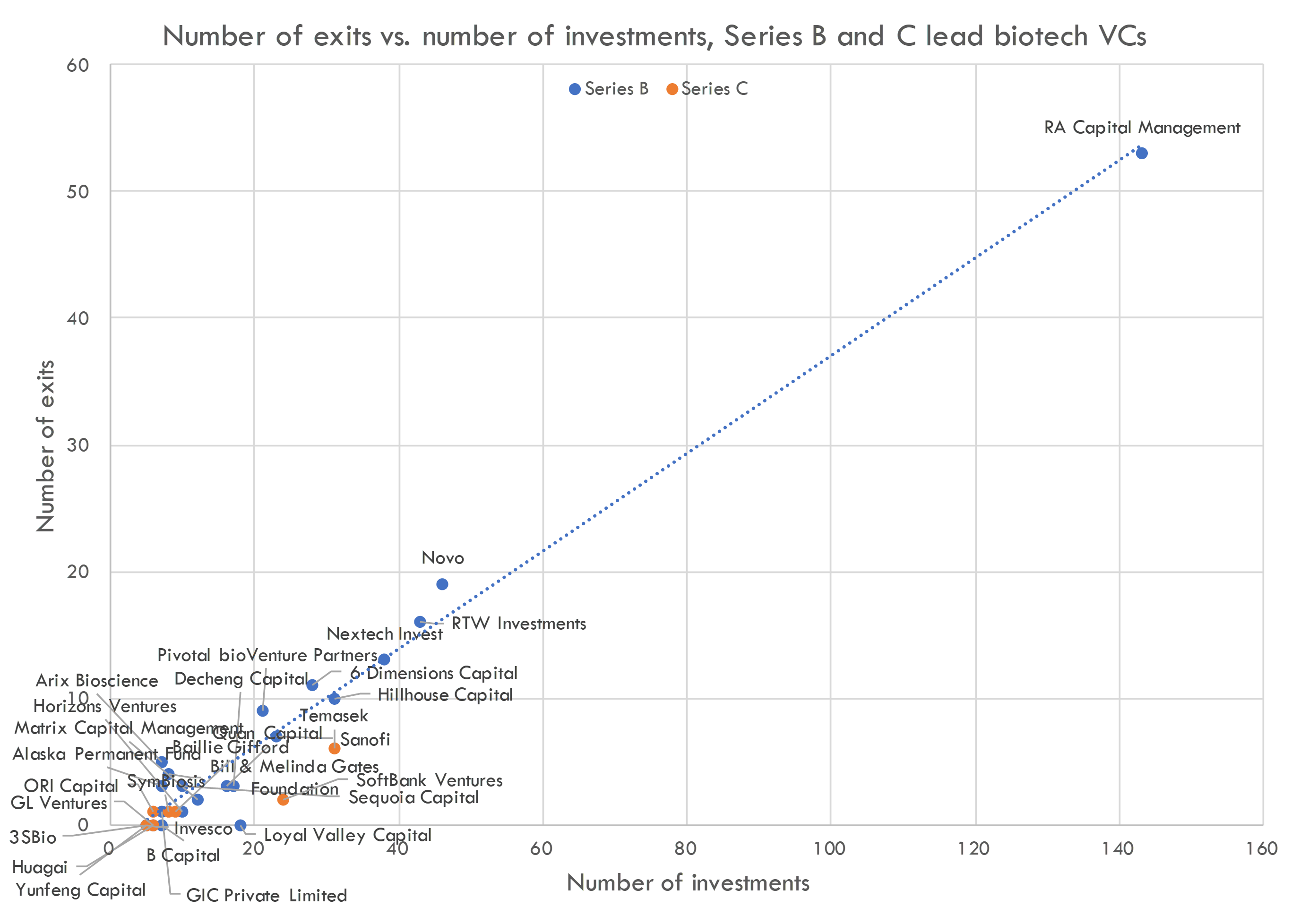
Above we show the number of investments and exits for each investor since January 2018.
RA Capital is the clear leader in terms of deal volume, with over 3x as many investments and over 2x as many exits as the second most active investor, Novo. 1 Because most biotech startup IPOs happen after Series B, RA Capital is in a sense the "gatekeeper" of the IPO market, leading most pre-IPO rounds and shepherding companies onto the public markets. If you are a biotech startup considering an IPO in the near future, you'll probably need to get RA in your round.
The below chart excludes RA Capital so we can see other investors more clearly.
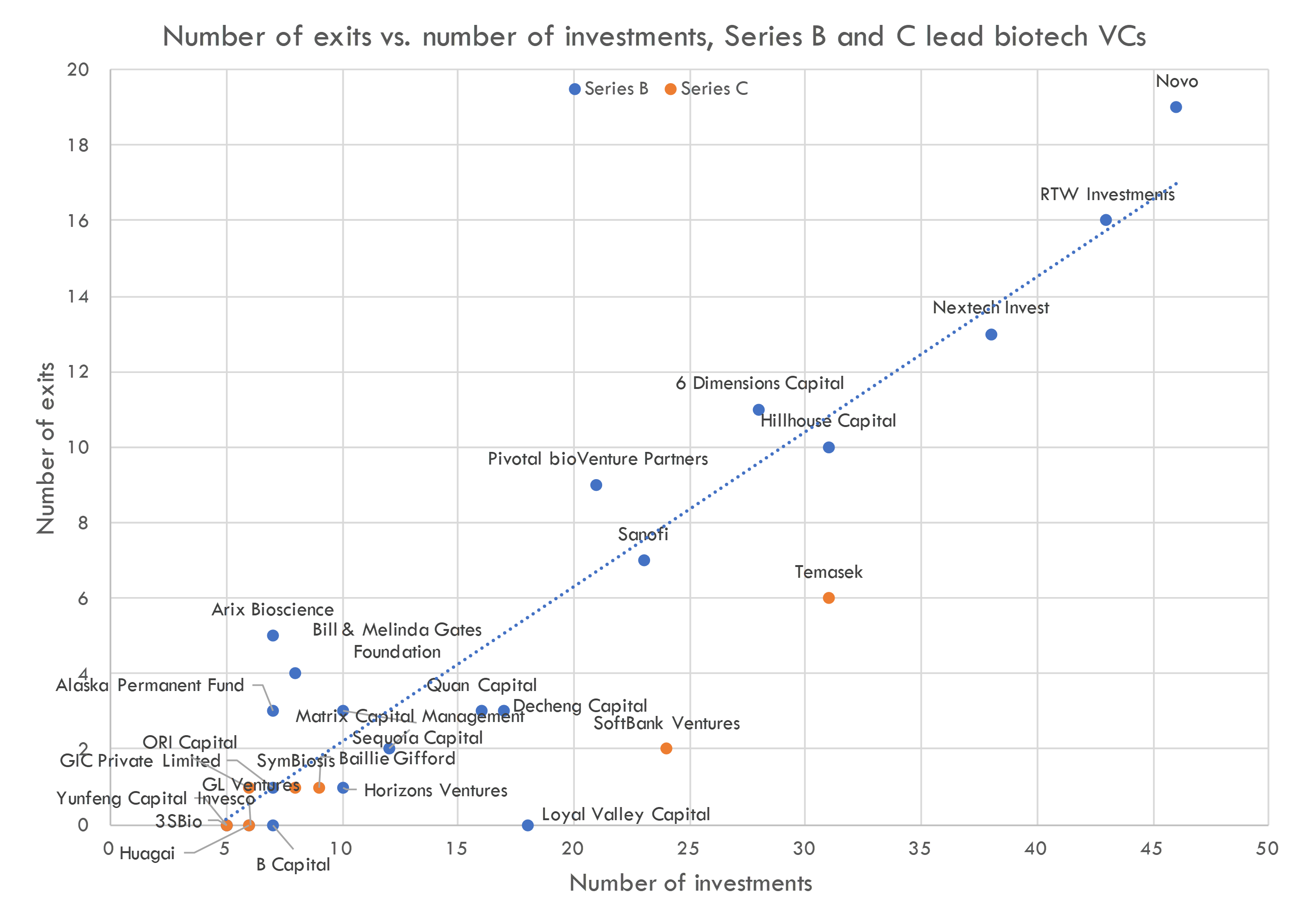
There are a few interesting takeaways from the above chart. First is that there are far fewer active lead Series B investors than active lead Series A investors (for more on Series A investors, see our previous post). Further, many of the Series B and C investors in this chart are no longer as active: many of these are Chinese investors (6 Dimensions, Hillhouse, Decheng Capital, Quan Capital, etc). Chinese investors were the most active lead investors in Series B rounds in biotech in 2018, but geopolitical tensions have led to a dramatic slowdown in Chinese investment into US biotech startups.
Another notable trend is the presence of sovereign wealth funds and LPs as lead investors. LPs, aka limited partners, are investors that provide venture capital funds with the capital to invest in startups. LPs include university endowments, sovereign wealth funds, pension funds, large asset managers, and other large institutions. In addition to investing in VC funds, these LPs are increasingly investing directly into biotech startups -- cutting out the VC middleman. Generally, these LPs follow-on in rounds rather than lead (we will discuss this trend in another post), but some actively lead deals.
If you are familiar with the biotech VC landscape, you may notice that the above chart excludes some very active Series B investors: Cormorant, Surveyor Capital, Casdin Capital, etc. This is because these investors generally don't lead rounds, and this post focuses on investors who lead rounds. We'll cover these "non-lead" investors in another post.
Investors above the dashed line have more exits per investment than the typical investor; those below the line have fewer exits / investment. Investors that generate more exits / investment don't necessarily perform better than those that generate fewer exits / investor, as we also must account for the returns generated by each exit.
It is important to emphasize that we can't draw conclusions about performance from this chart. Some funds that are below the trendline are simply newer to biotech investing, so their investments haven't had time to "mature" and generate exits. Funds can also be below the trendline because of fund strategy: investors who take more risks will show up below the trendline.
Returns and loss rates
To evaluate how fund performance is tracking, it also helps to know the returns of each exit (in addition to the number and rate of exits we saw above) and the percentage of exits that fail.
We use two metrics to estimate these: "weighted average MOIC" 2 of exits and "zombie rate". "Weighted average MOIC" of exits represents the weighted average of cash-on-cash returns: current value of an exited investment / cash invested into an investment, weighted by cash invested. The "zombie rate" reflects the percentage of companies that have gone more than two years without raising more money or doing a cash-generating partnering deal with a larger pharma company.
These are interim figures. Because most exits are via IPO these days, these MOIC numbers change with the stock price of the portfolio company (for more on post-IPO performance of biotech startups, see this post). Additionally, some "zombies" may go on to raise money or exit.
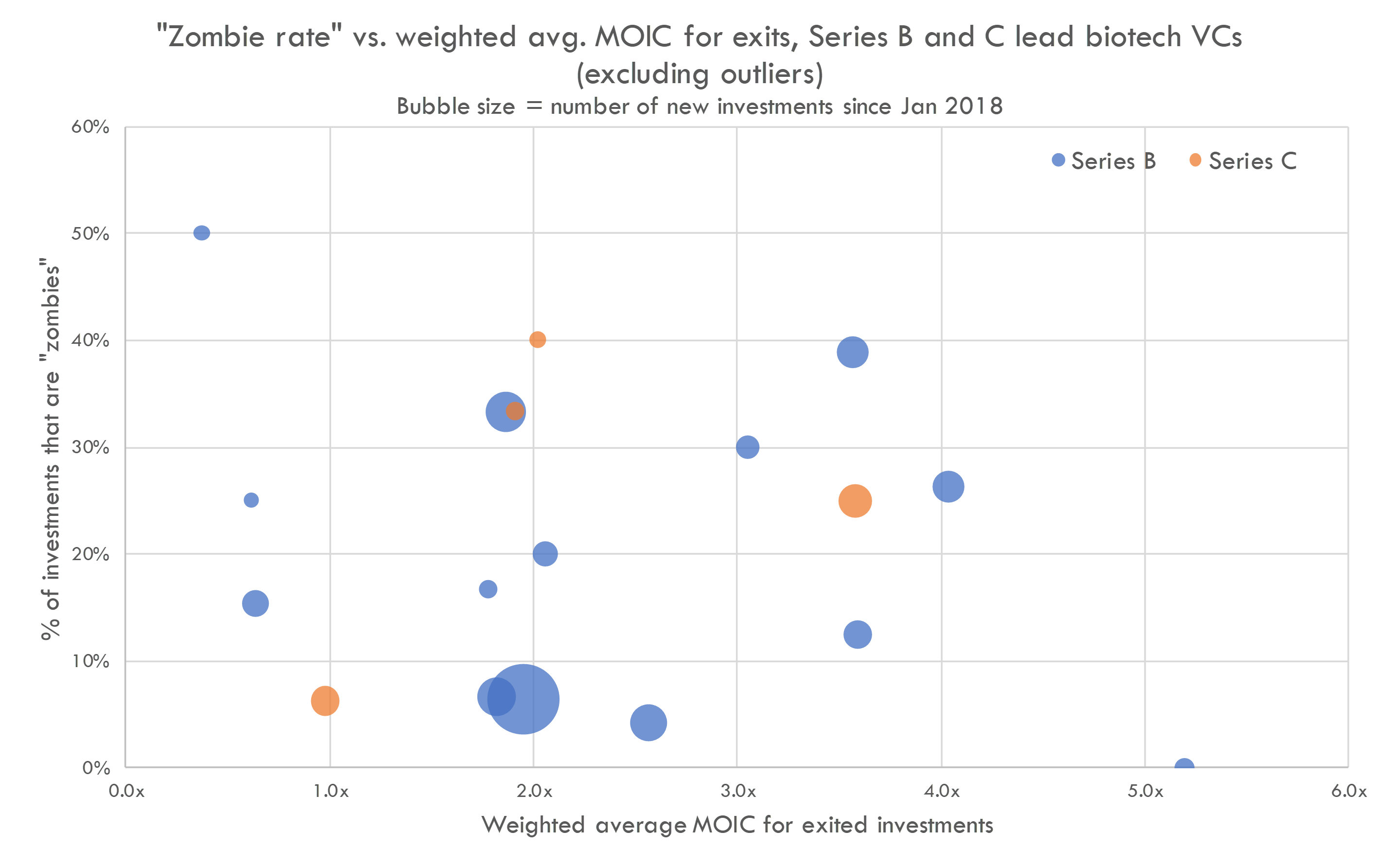
Above, we plot weighted average MOIC and zombie rate 3, with number of investments since January 2018 reflected as bubble size. This chart excludes funds with no exits, or exits where we don't have MOIC data (private M&A or exits where the investors had a small stake), so there are fewer firms in this chart than in the previous chart. We don't show fund names here -- non-anonymized data are only available to subscribers to our VC database.
We measure performance using MOIC in this table, but some of these investors likely care more about IRR than MOIC (as opposed to Series A funds, which are, like most traditional VCs, more focused on MOIC). The average IPO happens 6-18 months after the last private round, and many of these "crossover" investors have shorter holding periods than traditional VCs. So even funds that aren't on track to return a 3x may be performing well relative to their target IRRs.
As these are interim performance numbers that may not include all deals, we can't conclude anything about a fund's final returns from these data. However, this can help us understand investors' style and compare how they are performing on relevant metrics.
Benchmark VC performance
Deal-level cash-on-cash returns, proceeds from exits, check sizes, and more for 1,500+ biopharma investors covering $80B+ in global venture investment.
Ability to return capital
In an environment of ever-increasing funds sizes, another point of interest is ability to effectively deploy large amounts of capital. To better understand this, below we plot number of exits and weighted average MOIC of exits, with bubble size representing average amount invested in companies that exit.
Of course, a better metric here would be fund size vs. interim fund return, but that is a topic we'll explore in another post.
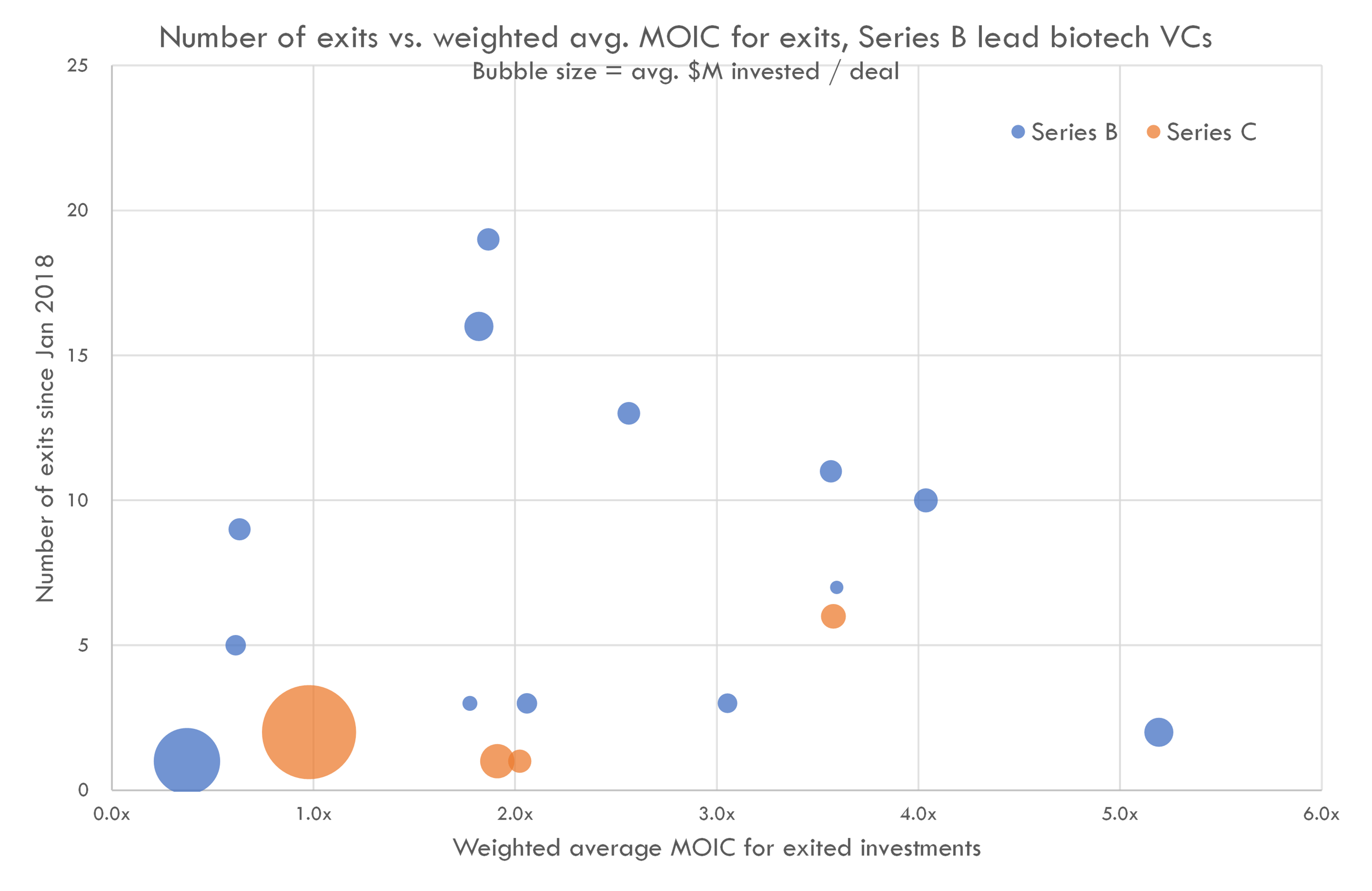
This chart excludes two outlier firms (RA Capital, an outlier in terms of number of exits, and another fund that is an outlier in terms of weighted average MOIC).
We see that two investors invest a very large amount per deal, but the performance of these investments is not as strong as that of their peers. We also see a few investors who generate a lot of exits, but only moderate returns per investment. If these investors don't have high "zombie rates", they likely generate high IRRs even though MOICs are not as high. There is another cluster of investors who generate high returns per deal but don't have quite as many exits.
In the next post, we will compare these "lead" crossover funds to crossover funds that are active but tend not to lead rounds. For access to our full investor database including non-anonymized performance metrics, fund size data, deal-by-deal returns, and more, check out our private biotech investor database.
Benchmark VC performance
Deal-level cash-on-cash returns, proceeds from exits, check sizes, and more for 1,500+ biopharma investors covering $80B+ in global venture investment.
1 Novo's investments include Novo Seeds, Novo Growth and Novo Ventures. Novo is classified as a Series B investor because that is the most common round they lead
2 This is not an exhaustive list of MOICs for each investor: this just includes deals where we know the amount invested by each investor, as this is weighted average MOIC.
3 Note that the percentage of zombies + the percentage of exits does not add up to 100%, as many companies have raised recently (so aren't zombies) but have yet to exit.